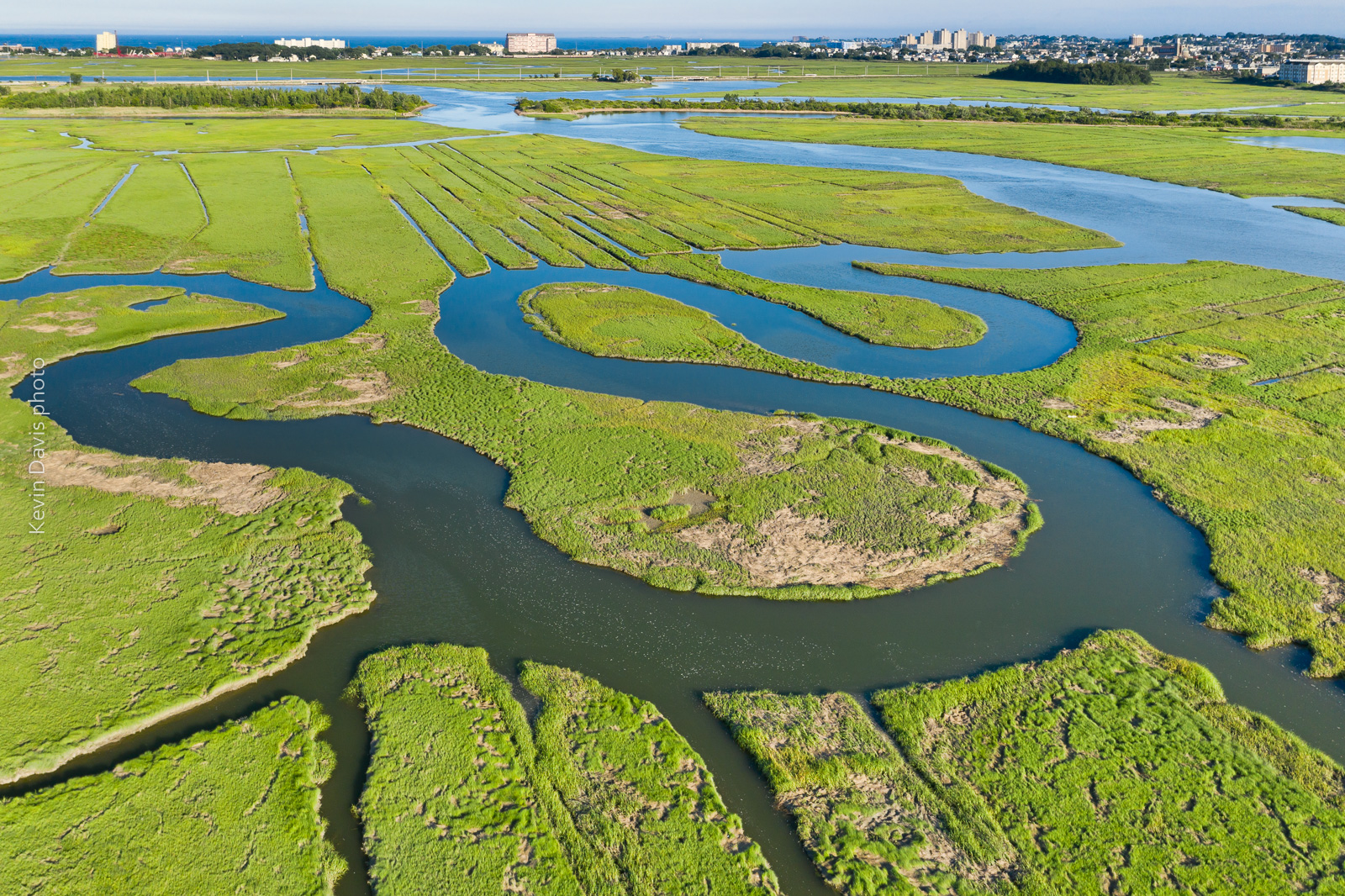
Rumney Marsh photographed with an aerial drone (sUAS)
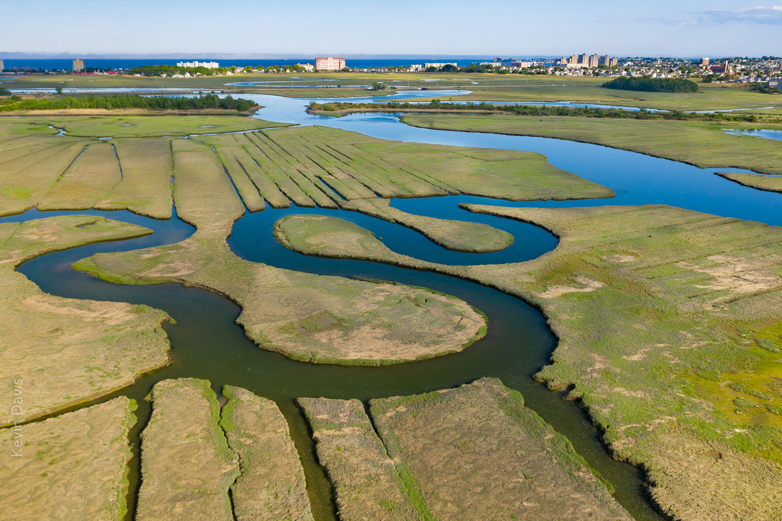
I first visited Rumney Marsh in the month of May. Although I discovered some great photo compositions, the marsh was mostly brown. Presuming that the grasses would fully transform the landscape into a greener palate, I vaguely planned to return some weeks later. Shown here below is my first image from the May visit:
Rumney Marsh in the month of May
.
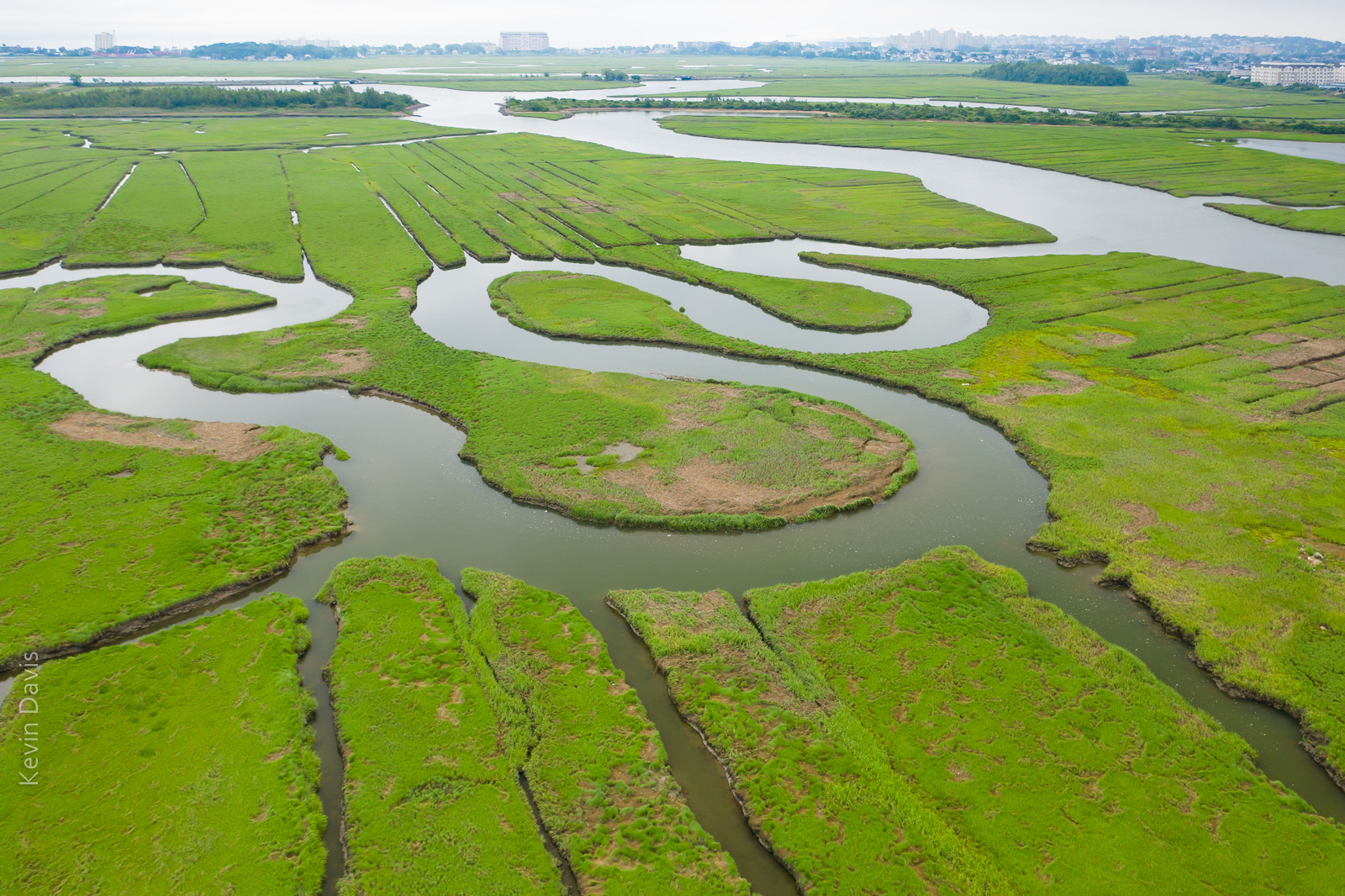
This year, spring in New England has featured more rain than normal. Dry days are a bit like currency – have to spend them judiciously. Five or six weeks later I returned to the marsh on a dry day and found the green grasses covered the land, as expected. Unexpectedly, coastal clouds were lingering and the water reflected white sky (not blue sky).
Rumney Marsh (June) under cloudy skies
While that is a nice image, … I had imagined the water reflecting a blue sky. So, I returned later that same day after the clouds cleared away. That final image is shown at the top of this article.
In all three instances, the image required post-processing for HDR, particularly because the buildings on the horizon were too bright. So each of these three instances is a combination of multiple exposures, simply to control the dynamic range of light.
Flowers blooming on Cherry trees is a harbinger of spring because Cherry trees bloom first, before other flowering trees. While these blooms are a much anticipated spectacle, predicting when the cherry trees will bloom … is difficult business.
From Macon Georgia to Boston Massachusetts, you can visit well-known groves of cherry trees. The trees bloomed in Georgia last week. Unfortunately, I missed it because of car trouble.
The very first blooms appeared in Macon GA around March 10. The very first blooms appeared in Washington D.C. just a few days ago.
The general blooming of Cherry trees in Washington D.C. has not happened yet, but should begin by end of this week. Midweek temperatures this week are still cool with overnight temperatures close to freezing. The current weather forecast tells that the temperature will warm this Thursday. So, blooms should be popping this coming weekend.
The best-known location around D.C. is the tidal basin, shown in the photo above. As you can see in this late-day photo, it can draw a dense crowd. You will not find crowds like this early in the morning.
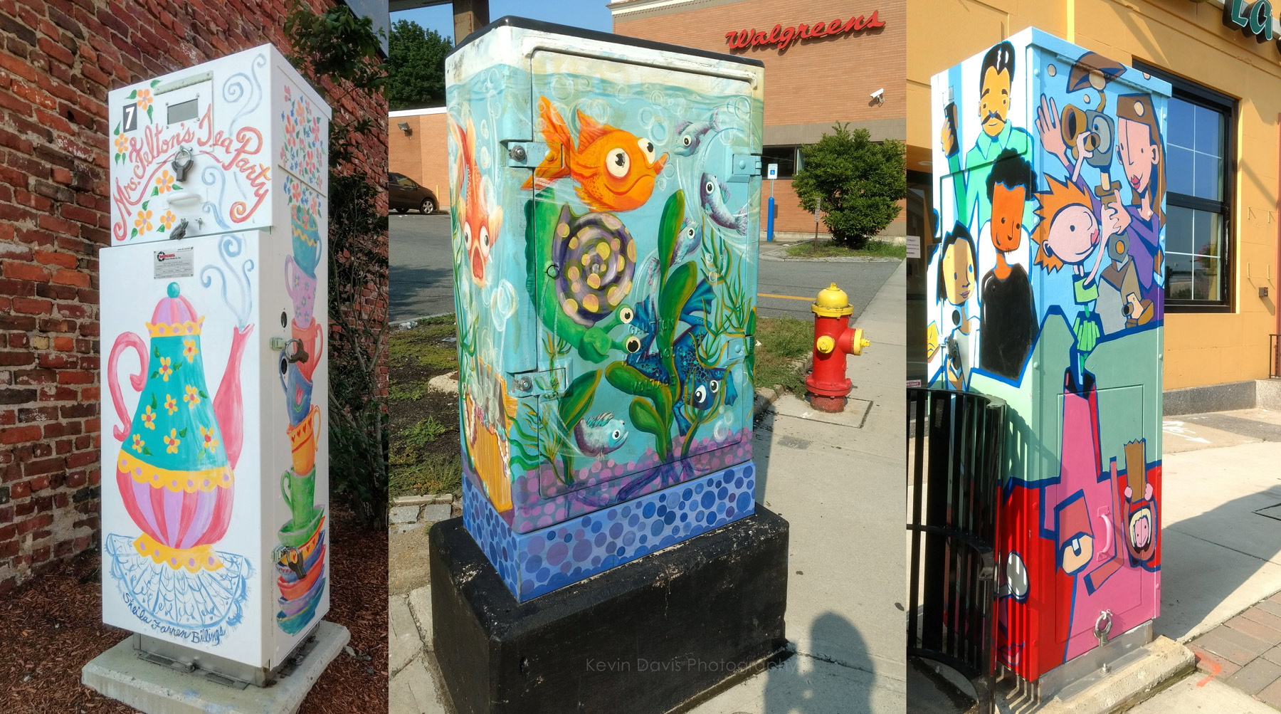
Stopping at a coffee shop downtown, I put a quarter in the parking meter. When I returned, 20 minutes remained on the meter, so I took a short walk. That’s when I happily discovered art on a utility box … and another … and another.
While I prefer a camera with interchangeable lenses, at times like this I am happy to have a mobile phone with a camera. My phone-camera is not a great camera, but as the saying goes … the best camera is the one you have with you.
I must also note that Android / Google Photos includes some photo post-processing functions that I rarely use but did use here. The leftmost image was badly overexposed. The problem was very well solved by applying “auto”.
(No, I’m not giving up my big interchangable-lens cameras.)
(Left) Panasonic Lumix G3, and (right) Panasonic Lumix G85
Panasonic has long maintained two similar MFT camera lines, DMC-G series and DMC-GH series. In general, the G series has been intended as mid-level cameras while the GH series has been a bit more high-end, but the differences have not always been obvious. All of the G and GH series cameras are system cameras with interchangeable lenses and hot shoe for external flash.
While I do own and use DSLR cameras, I have used Panasonic Lumix cameras as smaller alternatives. My typical day kit (less gear than a multi-day kit) includes a camera body, two lenses, and minor accessories. My Lumix G series kit is half the size of my DSLR kit.
While camera features improve with each generation, the MFT image sensors in the Lumix cameras seems to not change very much. The resolution has remained 16 MP up until the new G9, which introduces 20MP in the same FT/MFT format. In low-light, the RAW image noise is less than excellent but isn’t bad. Comparing the G3 to the G85, I see a small improvement in the newer camera, but it is small. It effectively gives me one more stop; the G85 noise at ISO 3200 is comparable to the G3 at 1600.
Features
After considerable study, here are the notable feature changes (notable in my opinion) starting with the G3 and moving to the very latest G9 (which I believe will ship later this month).
The G5 camera layout and handling is essentially the same as the G3
9 fps vs 6 fps
“Live MOS” image sensor has technical speed improvements, but same resolution.
Video recording supports MP4
Higher resolution in both the LCD display and the EVF
Eye-sensor below the EVF
Larger handgrip
The G7 layout and handling is significantly updated (compared to the G5)
4K video recording
OLED touch screen
4K photo mode
Wi-fi
The G85 camera layout and handling is essentially the same as the G7. Here are the important feature enhancements in the G85.
In-body image stabilization (sensor-shift type)
9 fps vs 6 fps
49 focus pts vs 27
Higher resolution in both the LCD display and the viewfinder display
The G9 camera layout and handling is new and includes an monochrome LCD info screen on top of the camera. This is a breakout camera that exceeds the G series moniker.
20mp MFT sensor
20 fps
225 autofocus points
Much larger viewfinder (EFV)
UHD/4K video up to 60 fps
6K photo mode
80MP image achieved by shifting the sensor 1/2 pixel and then combining the two images together.
Optional battery grip (for better handling in vertical orientation)
USB 3.0
Both Wi-fi and Bluetooth
More than 5 ounces heavier than the G85; a bit smaller and lighter than GH5
I love autumn in New England. The colors of the leaves here are world famous. The reason is the large number of sugar maple trees and a good number of red maple trees.
If you are planning your fall vacation, there are a some good web sites that can help, but most are simply reporting the foliage as it is right now rather than forecasting when peak color will manifest.
Here’s a reasonably good map that I found helpful:
Do keep in mind this is based upon past years and not necessarily an accurate prediction for this year. As they say in the stock market, past performance does not guarantee future results.
I’ve read multiple suggestions online that the color could be particularly vibrant this year, considering this year’s temperatures and rainfall. Eastern Massachusetts experience significant drought during 2016 … but not so in 2017.
Also consider the night temperatures are still warmer than usual. Tonight, temperature will finally drop into the 40s but warmth returns this weekend. This may mean peak color will be a bit later than usual.
In this particular case, standing on a tall bridge (with pedestrian walkway) provided a spectacular view.
Where to stand? I do ponder this question in advance whenever possible. But sometimes I don’t have detailed information in advance. If I recall correctly, on the day of this parade of sail, I did not know precisely where the ships would be sailing and realized the potential of the bridge only that morning when I arrived at the waterfront.
The question of where to stand sometimes involves the location of the sun. In the morning, sunlight will be coming from the east or southeast. Later in the day, it comes from west or southwest. That can be extremely important if my photographic expectations are front-light, back-light, or side-light.
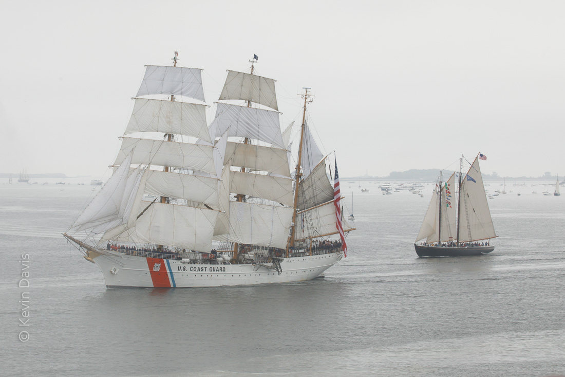
A staged event, such as a parade of sail, will generally have a fixed start time that is outside of my control. In that case, perhaps the biggest question is whether to stand on the left bank or the right bank. For a recent Sail Boston event, I knew that the ships would be sailing into Boston Harbor through a channel between East Boston and South Boston; I had to choose one location, as travelling between the different locations was impractical.
I first began photographing tall ships during SailBoston 2000. Since then, I have photographed tall ships many times from Philadelphia PA to Camden ME. SailBoston 2017 was not to be missed, being the largest gathering of tall ships in the northeast since 1976.
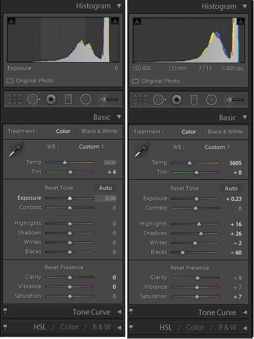
As the weather for the grand parade of sail was a big foggy, the resulting images were low contrast. If your camera is capturing JPEG images, then you might change the camera settings to increase the contrast. But for those of us who are sticklers for image quality and therefore capture RAW images, the camera setting for contrast doesn’t actually do anything. Here’s how I post-processed RAW images using Adobe Lightroom.
Original low-contrast image before post
(click on the image to see the full-resolution image.)
When lighting is low contrast, you have a choice of keeping that or compensating for it. If you choose to compensate, the most important step is usually to lower the black point. Essentially, low contrast implies that the darkest parts of the image render as a lighter tone and the brightest parts of the image render as less bright. Dark isn’t particularly dark and bright isn’t particularly bright.
With the original settings shown on the left, notice that the histogram at the top shows none of the image information extends to the far left. None of the image falls into the leftmost one third, the region of darkest possible tones. To pull the dark tones to the left, use the black clipping slider control. The settings on the right show the modified histogram.
Adjustments in Adobe Lightroom
Lightroom divides tonality into five regions, black, shadow, midtone, hightlight, and white. If you hover your computer cursor over any of the five relevant slider controls, the corresponding region will be highlighted in the histogram.
Dragging the black point to -60 is relatively heavy-handed and tends to drag the shadow areas down. Although I have raised the shadow brightness here, that is primarily to hold the shadows closer to the original brightness, compensating for the drag of the -60 black point.
Further increasing the overall contrast, I have raised the overall exposure brightness and the highlights. And I have made minor adjustments in color, to compensate for a slight green cast and slight yellow cast.
In addition to the overall image adjustments, I have made a few local adjustments. The hull of the Eagle was bit dark, due to the angle of the sun; so I brightened the hull slightly. The sails of schooner Adventure picked up a slight blue cast from the environment; so I moved that color slightly toward yellow. The white stripes of the American flag also picked up a bluish cast; so I moved that color slightly toward yellow, reduced the color saturation, and added a touch of brightness.
Finally, the foreground water appeared to be less bright, perhaps due to shallow depth. I applied a gradient filter to the foreground and bumped up the brightness to match the rest of the image.
Maybe these adjustments seem like a lot of work. But the overall image adjustments can be quickly and easily copied to other images. If the natural light of the day hasn’t changed, these adjustments are appropriate for many images, not just the one. Wherever the light did change, I have to make small adjustments and then apply that set of adjustments to a group of images.
With more than fifty ships in the parade of sail, I shot 250 images. I don’t give detailed attention to every single image. Duplicating adjustments to a group of images is a necessary time saver. And, of course, I will give the most attention to my favorite images, those that might be submitted to publishers or printed for wall decoration.
If you are in the Boston area during August 2017, stop by Boston City Hall and check out my exhibit of tall ship photography at the Mayor’s Neighborhood Gallery (2nd floor).
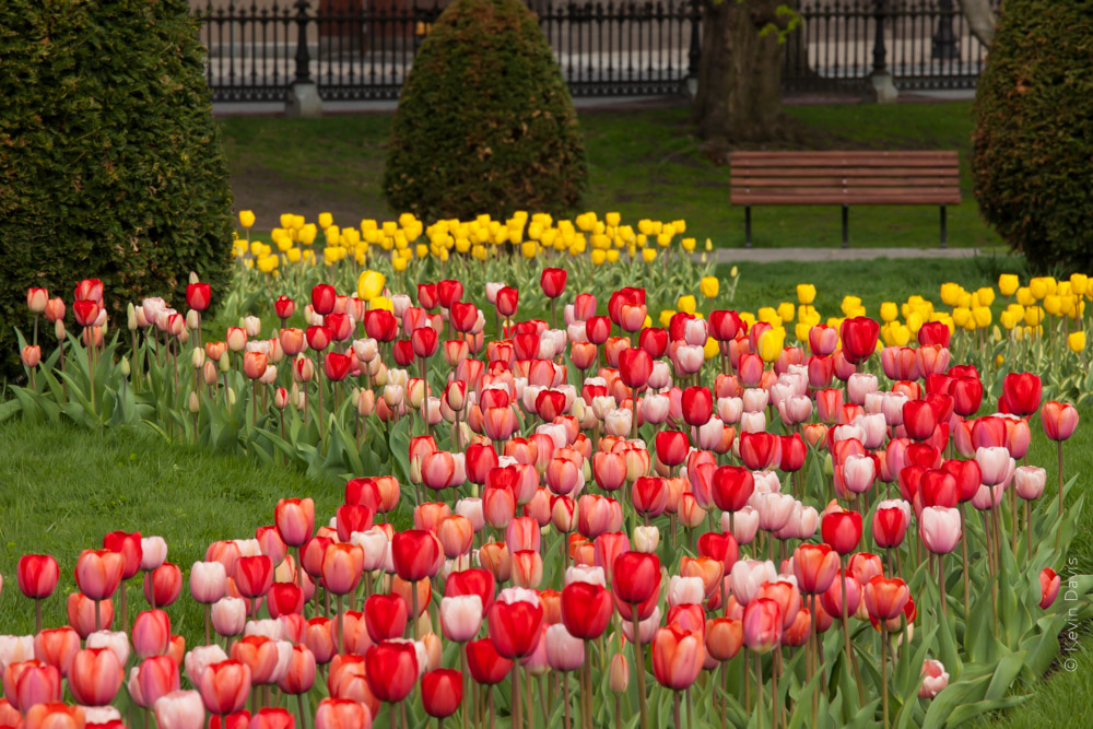
The tulips at Boston Public Garden. are an annual rite of spring. They are fun to photograph and I wanted to share some techniques with you.
This first image was shot at 7am on a Saturday morning. Early morning may be the only time when the garden isn’t swarming with people. To visually compress the distance, I used a 200mm lens.
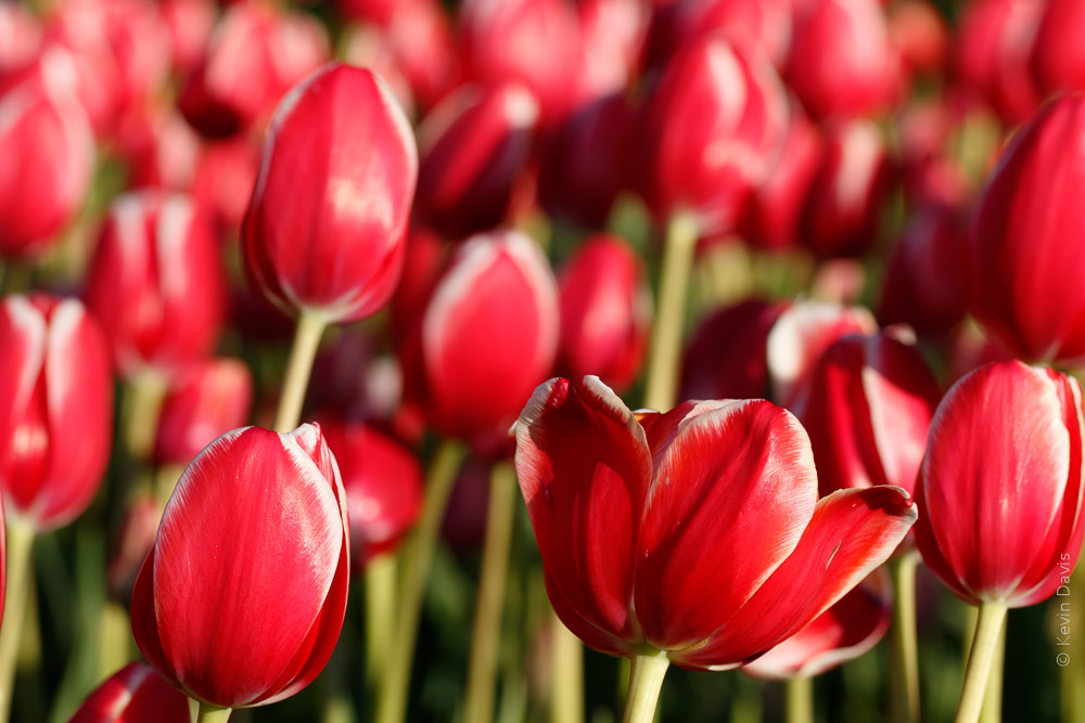
This next image is different for several reasons. Of course, this is a closer view. Using a 100mm macro lens at an aperture of f/7, the depth of field is shallow. I chose to fill the frame with flowers and exclude the surrounding environment. Also note that the light is very different. I shot this image after 6pm with the evening sun directly shining on the flowers from the side.
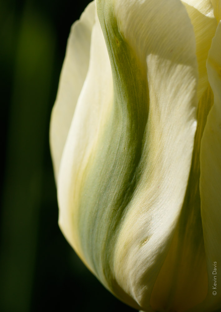
Getting even closer, the image becomes more abstract. The image is about color and texture; the concept of “tulip” begins to disappear. I specifically chose to use an evergreen shrub for the background, knowing it would fall away to black because this side of the shrub is in shadow. (You can dimly see a green tulip stem rising along the left side of the image.)
Taking a step back, not as close as the previous image, this is more obviously a tulip. Still working with the dark background, I’ve repositioned myself to achieve back-lighting from the setting sun.
Additionally, I chose to break a couple photography “rules”. Intentionally photographing through a foreground tulip creates a highlight in the bottom left. It was a gamble that I think paid off quite well. A viewer will naturally be drawn to the lower highlight and the upper highlight. After bouncing back and forth a few times, you eventually find the beautiful color and texture in between. I find that my mind dwells on this image longer than the others.
A combination of backlighting, dark background, and close-up abstract shape.
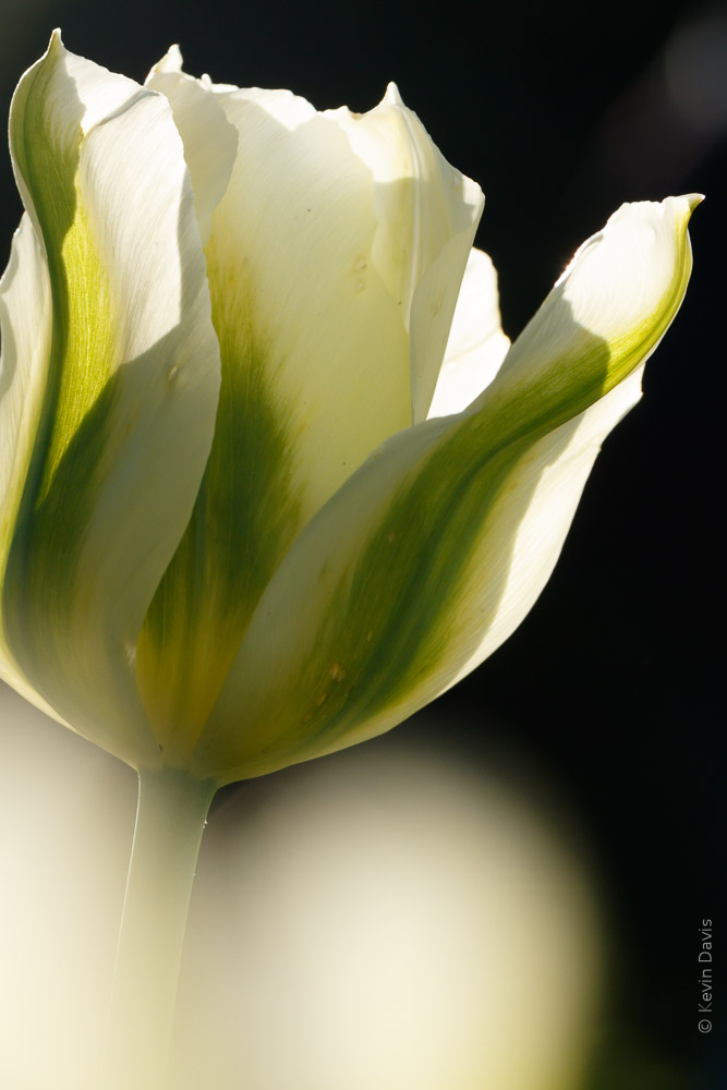
Upon thinking “how can I look at this subject with a different perspective?” I finished up the evening by looking down on the flowers from a steep angle, as the sun was soon to fall behind the buildings of Boston. I chose a more narrow aperture here, f 16, because I wanted to hold some depth of focus from foreground to background. And because a smaller aperture means less light entering the camera, I increased the ISO. Aperture priority, f/16, 1/160 sec, ISO 800, 100mm macro lens.
If you have a personal checking account, you can have your own photographs printed as custom backgrounds on your checks.
While some of my bills are payed automatically, either through my bank or credit card, I do still write checks for some things. Upon discovering that I only had one blank check remaining, I was about to order more through regular channels, but the price seemed a bit high. Searcing on-line, I found that other providers will print blank checks for far less money and you can order checks direct through their web sites.
Some companies allow you to upload your own photographs to be printed as the background image on your checks. Caution – some of those providers do not include security features, such as microprinting of the signature line. I found two providers that offer custom photo checks with security features, then researched them on-line to find positive/negative reviews. I selected one of these providers and then searched on-line for freely available discount codes. I found a discount code that saved me $3 per box of checks.
The photo I selected from my own catalog is shown here, an image of the Boston skyline.
Unfortunately, no guidelines were given how to size my photo appropriately. The web site did list specific file types that were acceptable and a maximum file size of 5MB.
Measure the height and width of your old checks. Then re-size your digital image accordingly. Personal checks (in the USA) are typically 6″ x 2.75″. I re-sized my photograph to slightly larger than 6″, thinking that the images are typically over-printed and then the paper is cut to a slightly reduced size. Set the print resolution to 300 dpi. Save the file as JPEG. Upload this file when the check-ordering web site prompts you to do so.
Choose a brighter image rather than a darker image. Text that is printed on the check will be difficult to see if the background image is too dark. The web site should show you a preview of the check with your photo and text. Upon seeing my check preview, I deleted the photo (the original shown here in this post), edited the photo to make it lighter, then uploaded the modified version.
To lighten a photo, raise the black point, which causes black to be rendered as grey instead of black. For example, in Photoshop, use either curves or levels. In Lightroom, in the Develop Module, use the Tone Curve. Simply drag the left-most point of the curve upward until it looks right to you.
Yoshino Cherry trees encircle the tidal basin at Washington D.C.
This week, I was thinking that the trees may bloom very early this year, particularly as a friend in N.Carolina reported that dafodils bloomed early, in mid-February.
Today, looking on-line at cherryblossomwatch.com
I see that the D.C. air temp through January and February this year has been warmer than the past six years.
As spring arrived particularly early in 2012, the Yoshino Cherry trees around the tidal basin bloomed early and disappeared BEFORE the opening of the annual Cherry Blossom Festival. Thankfully, I achieved a bit of photography the day before a spring storm blew away all the Yoshino flowers.
Historic first cherry bloom in D.C.
•2016: March 25
•2015: April 10
•2014: April 10
•2013: April 9
•2012: March 20
•2011: March 29
•2010: March 31
•2009: April 1