THE must-have application for photographers, Adobe Lightroom, is now available for mobile devices. The version for iOS devices (iPhone and iPad) is released and the version for Android devices is still in beta test. The beta for Android devices is available to KelbyOne members (http://kelbyone.com/android/).
Toying around with some software filters, I arrived at a painterly effect that I really love … in just 5 minutes. I’m not trying to put painters out of business – just having fun.
I started with an image from Lexington Massachusetts this past Patriots Day weekend. My first experiment did not yield a compelling result. Tried a second image, applied different filters, and shown here are all the phases of transformation.
The second step is done with Topaz Adjust. Adjust is one of my favorite tricks for adding a bit of “pop” to an image that seems a bit dull, however, here I used a preset called “Low key”, which I have never found any use for until today.
Processed with Bokeh, then Topaz Adjust, preset = Low Key
The last step is an painterly effect using Snap Art by Alien Skin.
Click on the image to see the larger view!
Processed with Bokeh and Adjust, then Snap Art
That was rather easy. Honestly, such experimental transformations are usually more difficult and end up with a result I don’t love … so, delete. I really like this one.
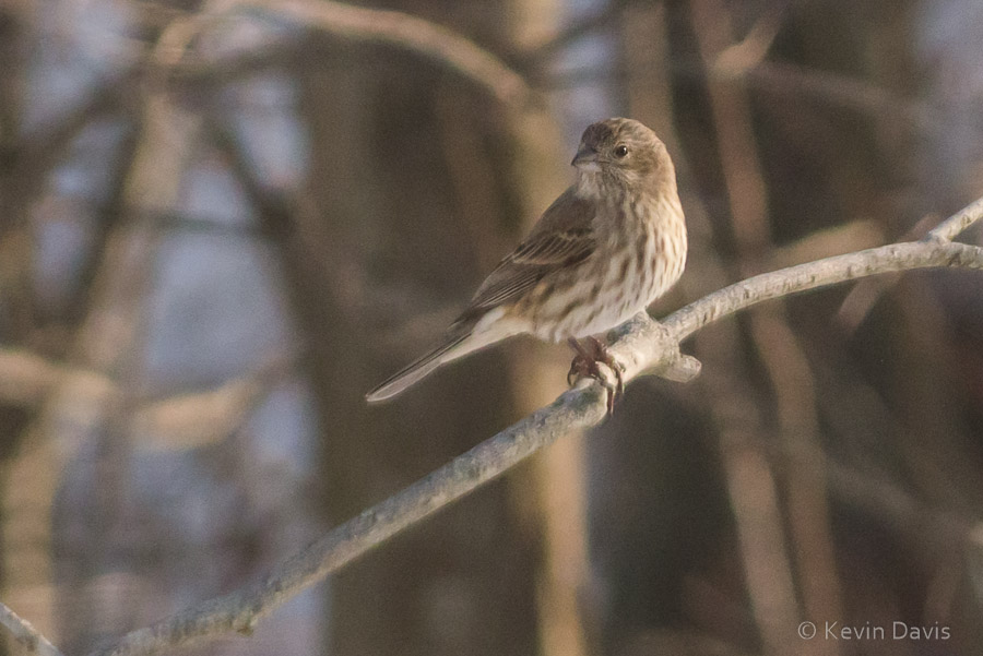
Last winter, I did a bit of backyard bird photography. Attached here is one of those images, where the bird looks quite good, but the background is distracting. As this was shot from my kitchen window, there was nothing I could do about the background (except maybe hang an artificial backdrop in the background trees
original image – shot with a MFT 45-200 zoom at f/8
Perhaps the background would be less distracting if the depth of focus was more shallow. A wider aperture might do the trick. This image was shot at f/8. The widest aperture on the lens is f/5.6.
Enter … a software filter called Bokeh2, by Alien Skin. The term ‘bokeh’ refers to the characteristics of an out-of-focus lens. Some lenses have a more visually appealing bokeh than others. The Bokeh 2 software simulates the bokeh effect and includes several presets that emulate specific lenses. So here is an edited version of the image, using Bokeh 2 to simulate an aperature of f/2.8 to soften the background and make it a bit less distracting.
Background softened using Bokeh 2
Although this does not entirely remedy the distracting background, it does reduce the distraction by softening it. You might achieve a similar effect with a basic Gaussian Blur filter, but Bokeh 2 aims to simulate characteristics of real lenses. This would be very significant if the background here had specular highlights, as real optical bokeh has a different effect than simple blur.
Photoshopworld opens with pre-conference workshops the day before the conference really starts. Yesterday, I participated in Real World Concert Photography. That was serious fun!
Today, opening day, began with the keynote address. At PSW, these things always involve a great deal of joking around … mixed with some serious stuff. The joking comes from the good folks at Kelby Training (official sponsor of PSW); the serious stuff comes from Adobe.
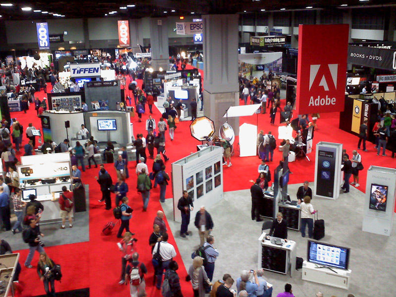
Well, just taking a break here to share a photo (from my phone) of the expo floor. I am missing out on some good info and inspiration, so I’m heading back in now.
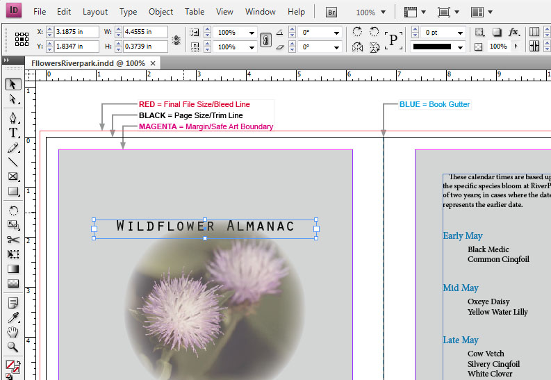
Typically, to create a print-on-demand custom photo-book, you download easy-to-use free software from the vendor/printer, layout your book pages, then upload the result for printing. But, alternatively, some vendors allow you to use other page-layout software. For my latest book, I used Adobe InDesign.
Having used the free software from three different vendors, I found them all quite similar and mostly intuitive to learn. On the other hand, Adobe InDesign is just a bit more complicated to learn, but much more flexible. If you can imagine it, you can do it. For example, a frame can be virtually any shape at all (a frame is a container for text or images). I used this flexibility several times throughout my book.
Adobe InDesign
There is one important difficulty to be aware of. The printing equipment used to print your book is almost certainly based upon CMYK inks, not RGB. All images must be converted to CMYK. When you use free software (downloaded from your PoD vendor), this conversion is done automatically for you. But when using other layout software, such as InDesign, you are responsible for doing conversion to CMYK.
Converting images from RGB to CMYK can be ugly. The conversion will necessarily shift some colors. And because CMYK is a smaller color space than RGB, some colors simply cannot be represented in CMYK.
In the case of my recent book, Wildflowers of RiverPark, I converted each image to CMYK using Adobe Photoshop. In general, rich green colors did not convert well to CMYK; no matter which conversion method I used, greens became horribly muted. With practice, I learned how to compensate for this. I was able to create a custom action to help this process, but it was still annoying and time consuming. Furthermore, one image in particular features vivid purple-magenta (flower is Deptford Pink) that could not be represented in CMYK.
In doing the conversions myself, and using the soft-proof feature in Photoshop, I gained one important benefit. The colors in the printed book are very accurate. If you rely upon your PoD vendor to automatically convert your images, you may get some unexpected color shift in your final printed book.
Specifically using InDesign provides another small benefit: InDesign works well with Adobe Bridge and Photoshop. From InDesign, create an emtpy frame, then hop over to Adobe Bridge, click on an image and choose: Place into InDesign. The image is inserted into the frame you created. After the image has been added to your book, making changes to the image is simple. Right click on the image and choose: “Edit Original” to edit the image in Photoshop. When you save your Photoshop changes, InDesign automatically picks up your changes and updates your InDesign document.


")